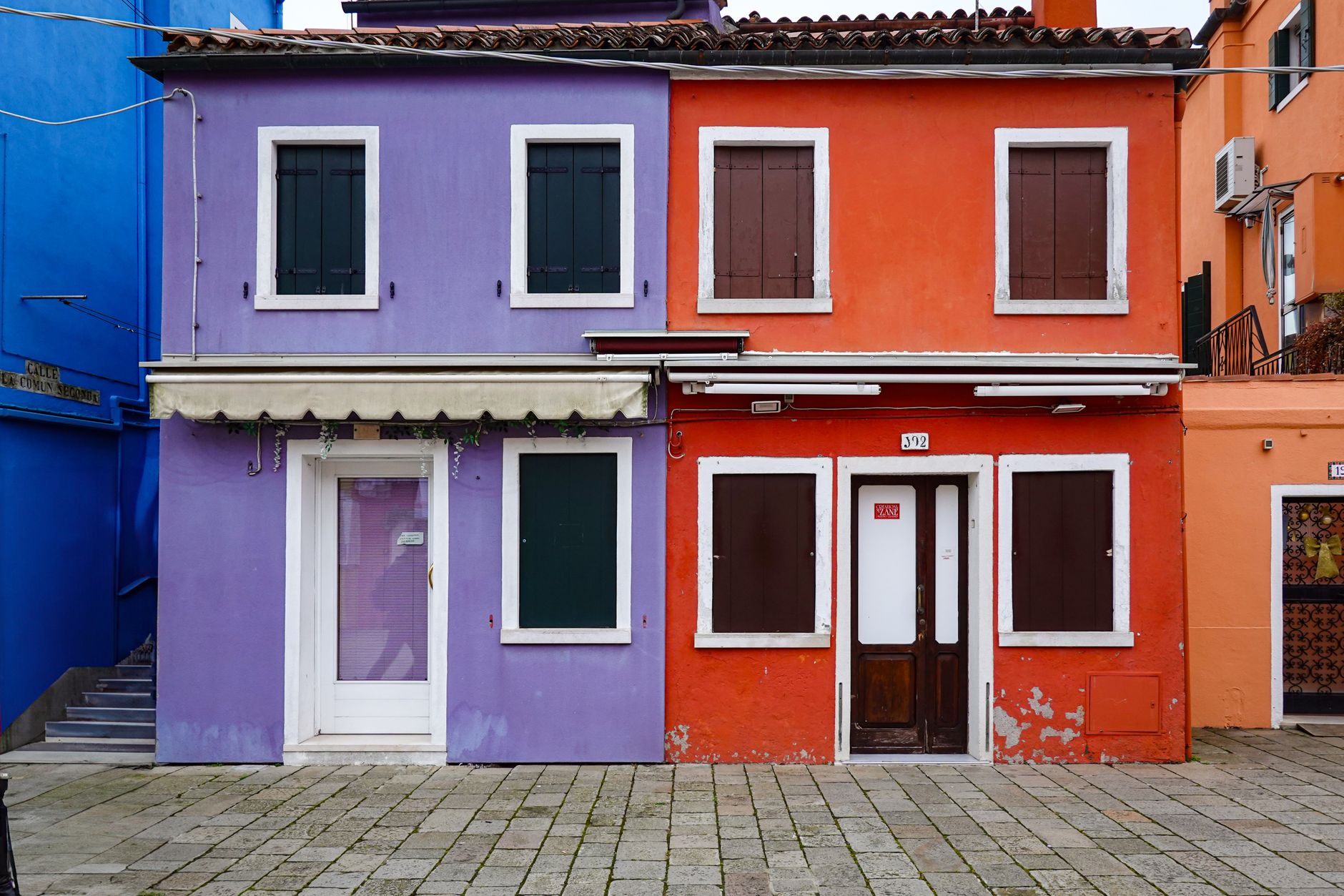
Understanding the Impact of Exterior Colours
Why Exterior Colours Matter for Curb Appeal
The exterior colours of your home play a crucial role in creating a memorable first impression. They not only reflect your personal style but also set the tone for the entire property. A well-chosen colour scheme enhances curb appeal, making your home more inviting and potentially increasing its value. On the other hand, colours that clash or appear outdated can detract from your home’s charm and even affect its resale potential.
How Colours Influence Perception of Your Home
Colours have the power to influence emotions and perceptions. Light hues can make a house appear larger and more open, while darker shades often convey elegance and solidity. Warm colours like reds and yellows evoke energy and warmth, whereas cool colours such as blues and greens suggest calmness and tranquility. Understanding these psychological effects helps you select exterior colours that not only look attractive but also set the right mood for your home.
Assessing Your Home’s Architectural Style
Matching Colours to Architectural Features
Every architectural style has a palette that naturally complements its design elements. For example, Victorian homes often pair beautifully with rich, deep colours and contrasting trims that highlight intricate details. Modern styles, on the other hand, benefit from minimalist palettes with neutral bases and subtle accents that emphasize clean lines. Identifying your home’s style allows you to align your colour choices with its inherent character.
Examples of Successful Colour Schemes by Style
Classic Colonial homes often shine with whites or creamy beiges paired with black or navy shutters, creating timeless contrast. Craftsman-style houses typically feature earthy tones like olive greens, burnt oranges, and browns to blend with natural surroundings. For Mediterranean-inspired homes, warm terracotta, soft yellows, and muted blues evoke the feel of sunlit coastlines. Drawing inspiration from these examples can guide your colour selection process effectively.
Considering Your Environment and Neighbourhood
Harmonizing with Natural Surroundings
Your home doesn’t exist in isolation; it interacts visually with the landscape around it. If your property is surrounded by lush greenery, choosing colours inspired by nature—such as sage green, stone grey, or sandy beige—can create a harmonious look. Coastal homes often benefit from light blues, whites, or seafoam greens that reflect the nearby water. Considering the environment ensures your house colours feel integrated rather than out of place.
Complementing Neighbourhood Colour Palettes
While it’s important to express your personal style, it’s equally critical to respect the aesthetic flow of your neighbourhood. Observe the common colour themes in your area and aim to complement rather than clash with them. A house that stands out for the right reasons enhances the overall appeal of the street, while one that conflicts sharply can detract from the neighbourhood’s charm. Subtle variations on traditional palettes often strike a perfect balance.
Choosing a Colour Palette: Base, Accent, and Trim
Selecting a Dominant Base Colour
The base colour covers the majority of your home’s exterior and sets the foundation for the entire palette. This choice should reflect both your architectural style and environmental considerations. Light neutrals like soft greys or off-whites offer versatility and longevity, while bolder bases like navy or charcoal can make a striking statement when paired with the right accents.
Picking Accent Colours for Doors and Shutters
Accent colours add personality and focus to specific elements such as front doors, shutters, or shutters. A bright red door can create an inviting focal point, while deep greens or blues offer a more subdued but elegant touch. The key is to pick accent colours that contrast well with your base so these features stand out without overwhelming the overall look.